




What Color Door Makes A House Look Expensive?
A front door can make a house look more expensive when its color creates deliberate contrast, complements the façade, and is supported by a high-quality finish. Deep black, charcoal gray, bronze, muted green, rich brown, and warm metallic tones are among the most effective choices, but there is no single premium color for every property.
The most expensive-looking result comes from coordination. Door color, material, panel proportions, handle finish, exterior lighting, and surrounding architecture should appear to have been selected as one composition.
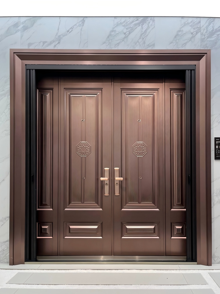
Table of Contents
- Black: Strong, Architectural, and Versatile
- Charcoal and Deep Gray: A Softer Premium Choice
- Bronze, Champagne, and Warm Metallic Finishes
- Rich Brown and Wood-Look Finishes
- Muted Green and Deep Blue
- Finish Quality Matters More Than the Color Name
- Match the Color to the Door’s Proportions
- Request a Custom Color and Finish Proposal
Black: Strong, Architectural, and Versatile
A black front door gives many homes a clean and structured focal point. It works particularly well with white, light gray, natural stone, and warm timber façades.
However, flat black surfaces can reveal dust, fingerprints, scratches, and uneven coating. In very sunny climates, dark finishes may also absorb more heat. Buyers should consider surface-treatment quality and exposure before using black on every project.
Matte or finely textured black often looks more refined than an excessively glossy finish.
Charcoal and Deep Gray: A Softer Premium Choice
Charcoal gray creates much of the visual strength of black while appearing slightly softer. It pairs well with concrete, stone, brick, glass, and modern metal window frames.
For residential developments, gray is also easier to coordinate across multiple façade schemes. Different undertones matter: a cool gray may suit concrete and blue-gray stone, while a warmer charcoal is usually better beside beige or brown materials.
Bronze, Champagne, and Warm Metallic Finishes
Warm metallic finishes can give an entrance greater depth and individuality. Bronze and champagne tones work particularly well with cream stone, warm gray render, walnut-colored details, and landscape lighting.
The objective is not to make the door excessively reflective. Controlled metallic textures and brushed effects usually appear more sophisticated than bright mirror-like surfaces.
Hardware should be coordinated carefully. A warm bronze panel beside cold chrome handles can look accidental unless the contrast is intentional.
Rich Brown and Wood-Look Finishes
Brown and wood-inspired finishes bring warmth to aluminum or Steel Entrance Doors. They can complement traditional architecture while maintaining the dimensional stability and maintenance advantages of metal construction.
A convincing wood-look finish needs appropriate grain scale, color variation, and panel direction. If the printed pattern is repetitive or overly glossy, the door may look less premium.
Modern wood tones are usually quieter and less orange than older decorative finishes. Walnut, smoked oak, and dark teak-inspired colors tend to suit high-end façades.
Muted Green and Deep Blue
Muted green, forest green, and deep navy can create an elegant entrance without relying on neutral colors. They work best when repeated subtly in window frames, landscaping, exterior furniture, or architectural details.
These colors are particularly effective on classic or transitional homes. The panel design should remain restrained so the color becomes a sophisticated feature rather than a visual distraction.
Finish Quality Matters More Than the Color Name
Two doors in the same color can look completely different. Surface preparation, coating consistency, gloss level, edge finishing, panel alignment, and hardware quality determine whether the final result feels premium.
Consider these details before approving a finish:
Is the color suitable for exterior exposure?
Does it remain consistent between the frame and door leaf?
Is the gloss level appropriate for the architecture?
Will the finish show fingerprints or dust easily?
Does the handle complement the door surface?
Has the approved sample been checked under natural light?
Our customized metal entrance doors can be developed in different colors, panel treatments, textures, and hardware combinations. We use production control and pre-shipment inspection to help keep the approved design consistent across export orders.
Match the Color to the Door’s Proportions
Color cannot correct poor proportions. A premium entrance should also have a suitable panel scale, frame width, handle length, and relationship to nearby windows.
Dark colors can make a very large door appear visually compact. Lighter metallic tones can emphasize the width and surface detail of the panel. Vertical grooves can make the entrance appear taller, while wide horizontal divisions emphasize width.
Our stainless front doors and aluminum front door range provide different starting points for contemporary and decorative entrance designs.
As a reliable export supplier of luxury entrance doors, we can coordinate material, dimensions, color, panel design, hardware, and packaging for distributors and project buyers. This prevents buyers from selecting an attractive color that cannot be reproduced consistently in volume production.
Request a Custom Color and Finish Proposal
Looking for a front door color that fits your target market or architectural project? Send us the façade reference, required dimensions, preferred material, finish sample, hardware style, quantity, and destination. We can review the combination and prepare a customized entrance-door proposal.
Explore our luxury entrance door solutions and obtain a quotation.